Blog, Graphics, Uncategorized
Basics of Graphic Design
Being an architect, I have always look out the ways of representing the data in an effective way, so that the motive spread out loud to the jury or the audience. It is really important to convey your thoughts clearly, therefore the knowledge of graphic design becomes important and mandatory. You actually don’t need any past experience in Graphic Design, only your interest in the subject will do.
Welcome to Graphic Design Basics
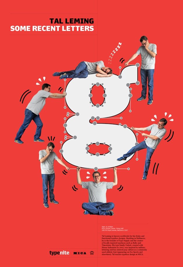
There are different elements to Graphic Design, and one of them is Asymmetry and symmetry.
Now, the question comes what is the difference between these two.
1. Symmetry vs Asymmetry
One of the designer’s most basic visual tool is the distinction between symmetry and asymmetry. You may be surprised how much we can enhance our work with this powerful distinction. Many natural organisms are symmetrical. Look at all of us, we all are symmetrical, our arms or legs keep us balanced. A leaf grows outward in a symmetrical pattern. The arms of the starfish radiate outwards from the center that’s called radial symmetry. Look at a butterfly, it’s both left and right sides are similar.

Symmetrical layouts are inherently stable and balanced that’s why designers for centuries have gravitated to the centered layout. In a symmetrical design, I should be able to draw a line from top to bottom and it’s the same on either side or I could draw a line through the center and it’s the same above and below.
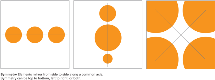
Symmetry is inherently understandable because we can all related to human beings that are symmetrical. However, I love asymmetry.
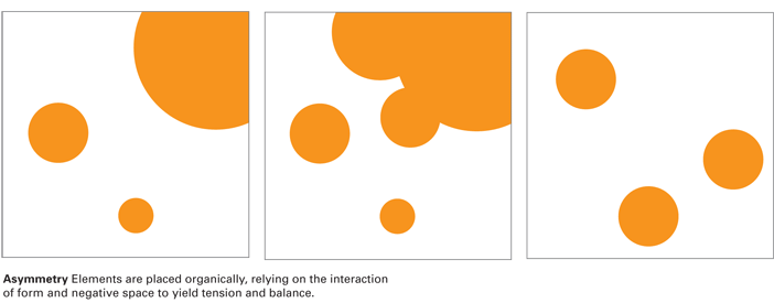
What is asymmetry?
Asymmetry in design is distributing elements and moving them around until they really do feel balance. Nature is full of asymmetry as well, a mountain has balance even though its volumes are irregular.
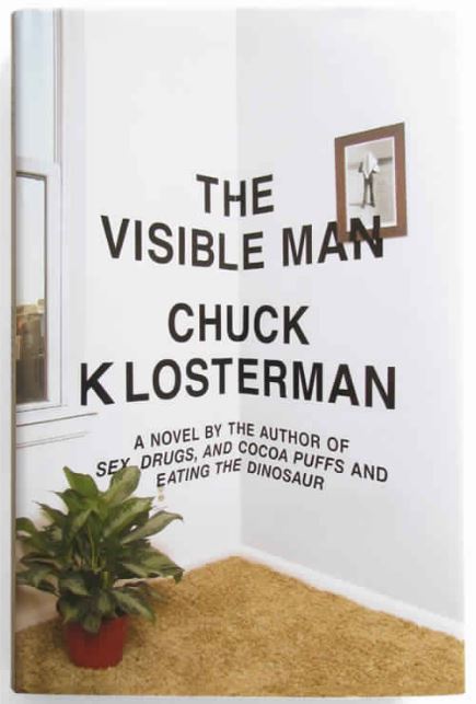
This book cover design by Paul Sahre is asymmetrical, the chaos created by the geometrical patterns at the bottom is creating dynamism and the blank space the at the top is keeping the design balance.

This poster by Rick Valicenti of asymmetrical distribution, the layout feel alive yet balance. When I use the term dynamic or dynamic asymmetry what I am really referring is to the viewer’s eye actively move around and through the design.
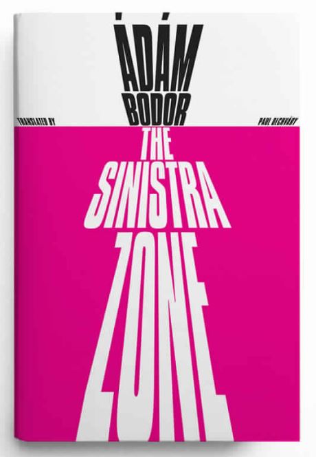
Here, the designer Paul Sahre position series of the text right through the spine of the photograph.
In this postal series by Richard Blake, you see some solution are strongly symmetrical and some are asymmetrical, every design depicts tension and movement through contrasting colors, shapes and patterns.
So, here is a tool, symmetry versus asymmetry, it’s basic and it’s universal.
Symmetry is balanced. It makes sense, it relates to so many things in nature. But as a designer, you need to know how to harness it in a creative and dynamic way. I love asymmetry. For me, asymmetry really energizes the page by moving the eye all the way organically through the page and in a much more exciting way.
2. Framing
Graphic Design is an art of framing, creating layouts, designers bring attention to. It could be images and text with margins, borders, and cropping. Every photograph is really an active framing like we use the camera to focus on points of interest.
In these pictures, the photographer finding another frame inside the frame to further direct the eye.
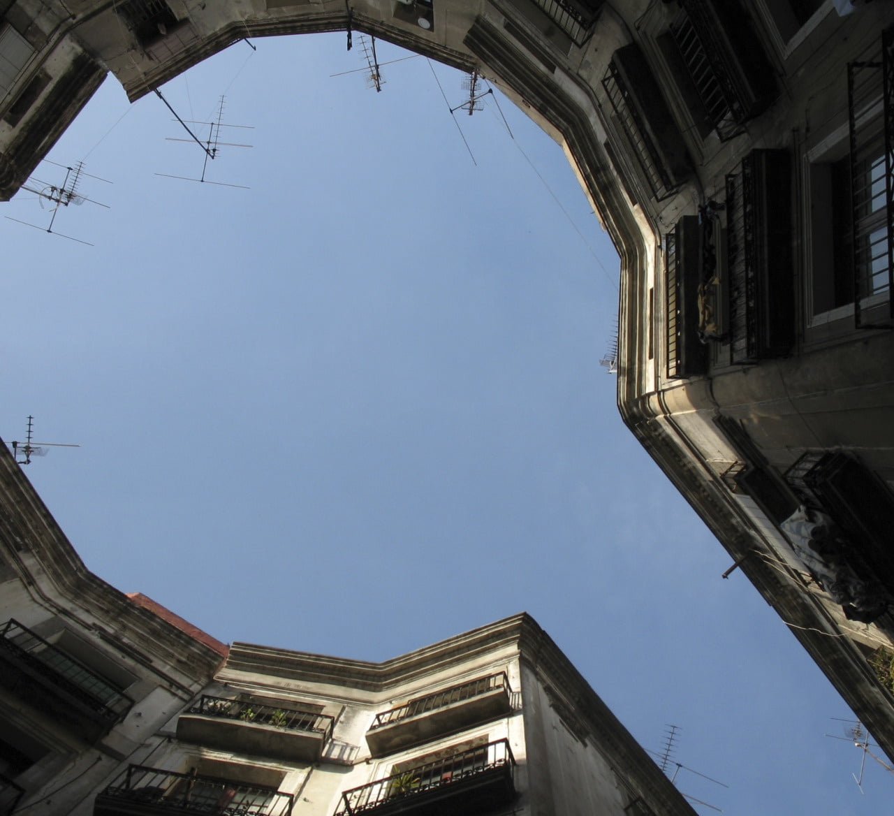
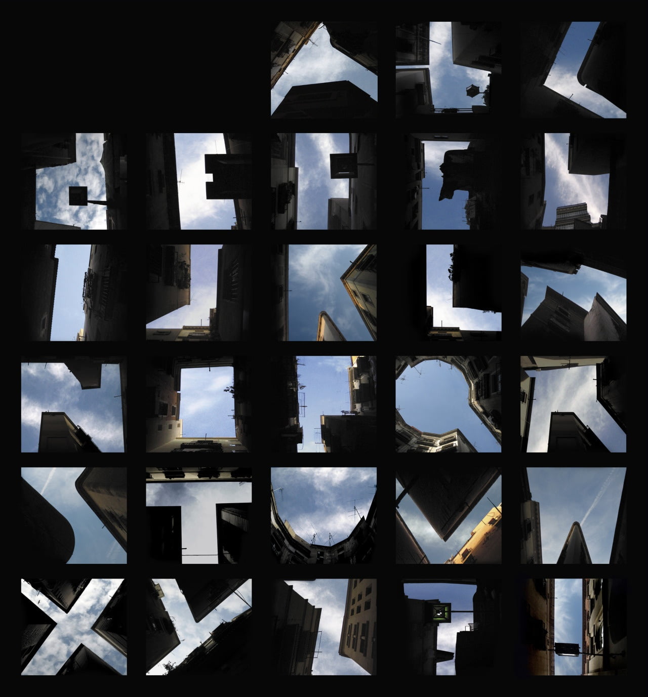
Lisa Rienermann created this alphabet by photographic spaces between buildings.
Margins and bleed affect how an image occupies space. To think of a margin, it is a kind of protective border around a picture. Framing draws attention just by being empty.
A bleed is an opposite. A bleed goes right off the edges of the page and it brings us more inside the picture, makes it immediate. Designers also use partial bleed where some of the pictures go off the edge but there’s some left over. Partial bleed is really useful because it creates a space for texts or captions.
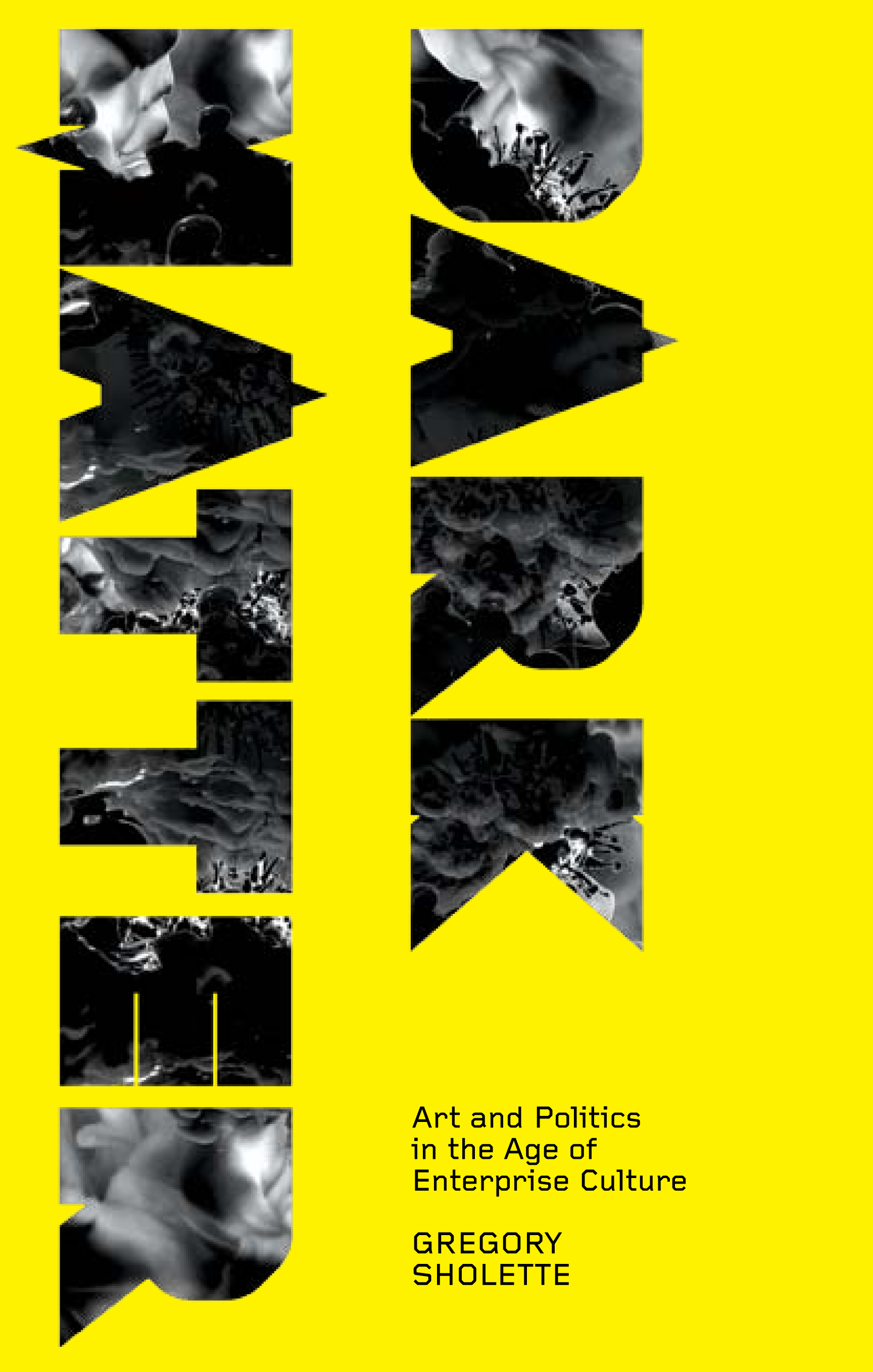
Here, the designer Gregory Sholette used alphabets as a frame to secure an image.
Cropping an image can change its shape and proportion as well as a sense of drama, intimacy or abstraction. Cropping a photograph and making it bleed changes its impact.
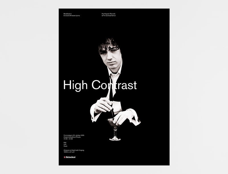
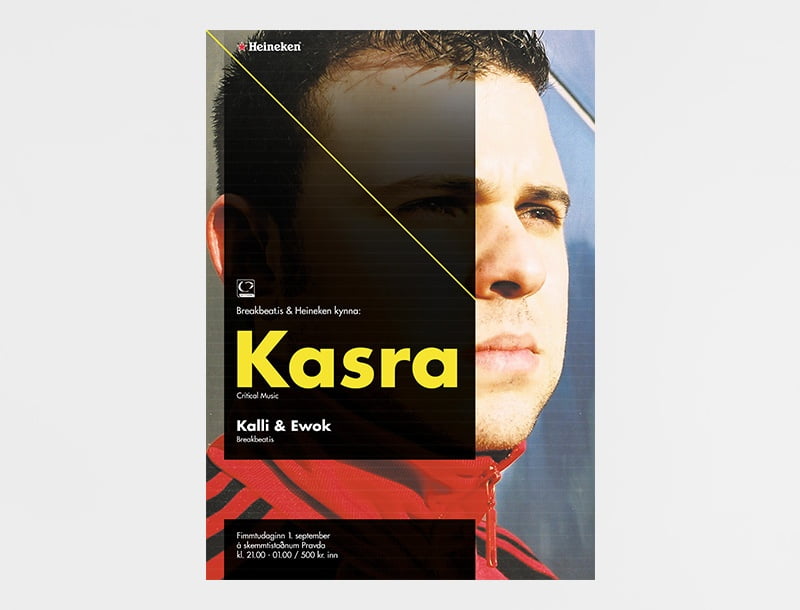
In this poster by Ragnar Freyr, the figure appears to be framed with high contrast it is making with skin tone and black background.
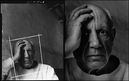
Here in this photograph of full bleed, the character feels like he is directly in space.
In this street campaign, designed by Shiva Nallaperumal, simple printed posters have been pasted directly to the wall. Then an image, headline, and logo have been stenciled right on top of that, in a way, that goes beyond that underline printed sheet. So here again, you have a frame that doesn’t quite contain the content that brings out our attention to.
So, this is what graphic designers do, they crop a photograph, they place an image in space. They put a border around a text or around a picture. Every time you are cropping an image on Instagram, you are framing. Every time you put a picture in the middle of a page, you are framing. Every time you choose whether to put a border around an image or to leave it clean, you are framing.
3. Scale
Generally, how big or small something is depicted by the scale of the object. The scale is relative. An element will seem larger or smaller depending on its context.
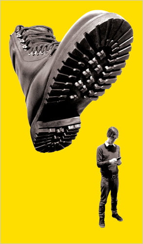
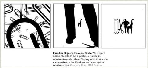
Scale conveys meaning. Here, large objects appear to be closer and small objects appear to be farther away. Cropping also enhances the feeling of scale. A dramatic contrast in scale can bring life and excitement to a typographic layout.
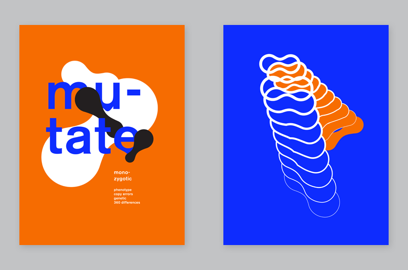
Scale relationships can be conceptual, a large element might be more important.
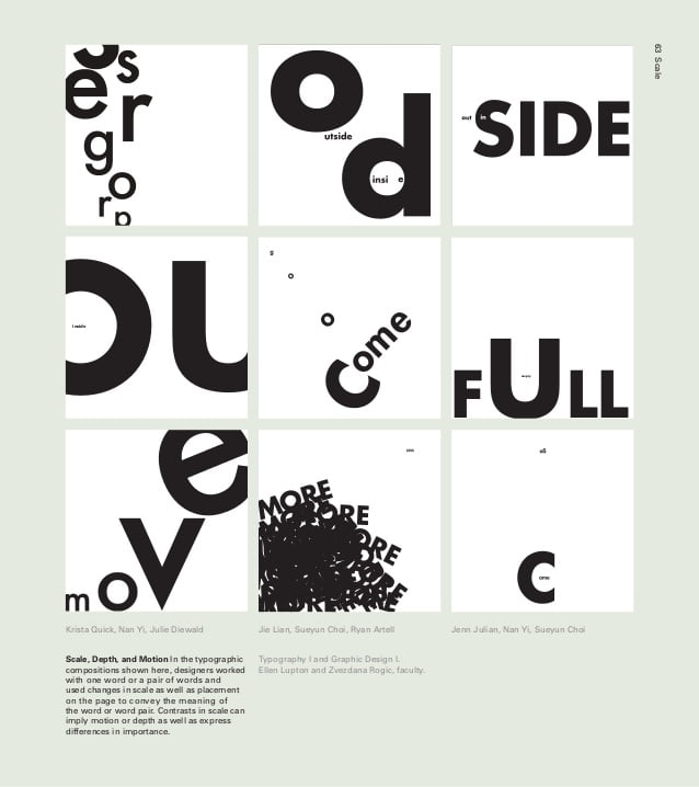
In this data visualization, not only scale but depth and motion of characters are used to represent the precise differences in the literal meaning of the word.
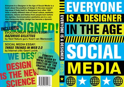
Everyone is a Designer, M. Gerritzen and G. Lovink, Bis Publishers 2010
This poster is about digital media and culture. The book itself is really small but the type is unusually large. So, the scale is really a relationship.
How does the size of one thing relate to something else?
A scale is an important tool in graphic design because it can often energizer design by changing what we expect. Often when you take an element and change the scale in a way that you’re audience doesn’t anticipate. You can surprise your items by making something is typically really big really small and something really small really big. So make your headline a little bit bigger. Make sure text is a little bit smaller so that you might have more attention and interest between these elements.
4. Hierarchy
The visual hierarchy gives order to information that allows readers to navigate complex content to get a big idea quickly. Why does content book pages look so bad because they are a fussy cluttered hierarchy? Let’s take a closer look…
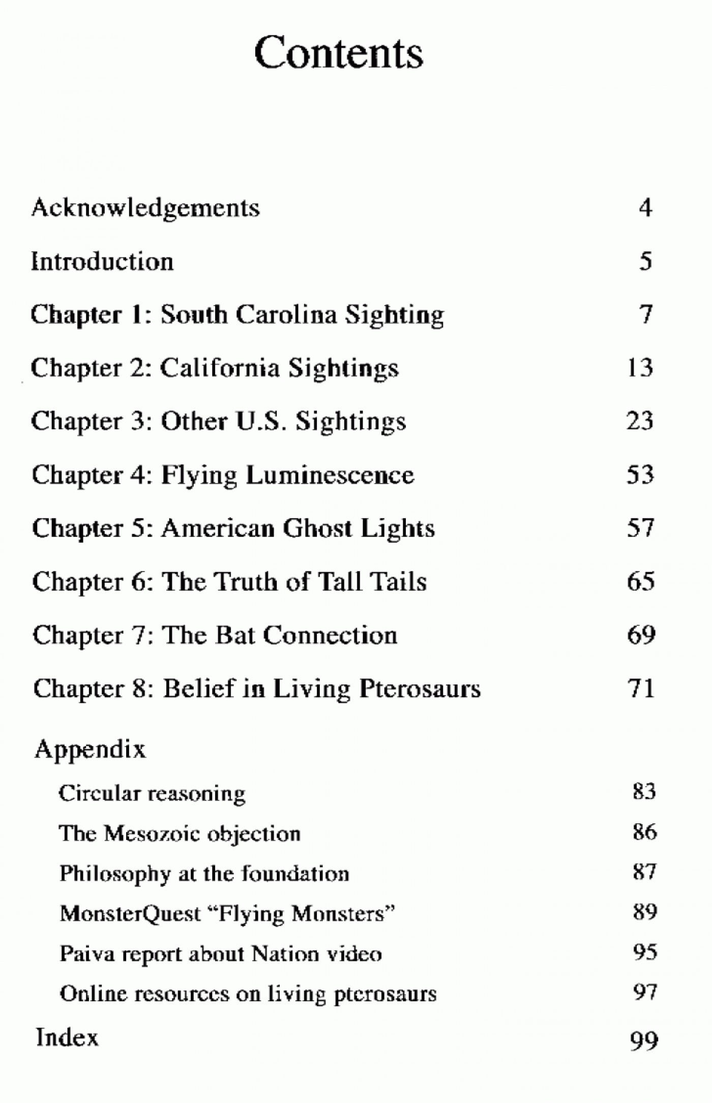
So this table is from an old book and it repeats the word chapter over and over and over again, very bad manners. The page numbers are situated far away from the chapter titles so it’s not even easy to read. This guide book uses that old fashioned method of outlining that you learned in high school.
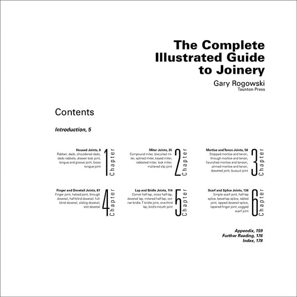
See below contemporary content layout design, its synching and it’s dramatic. Check this out, I love this kind of thing, the page numbers are right next to the titles of the chapters so you don’t have to number the chapters at all. You can really easily find what page the content is, that you are looking for.
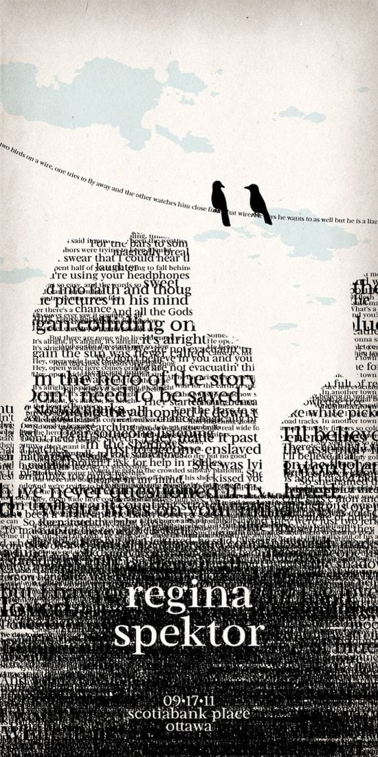
Regina Spektor- Typography Poster by *NaylaSmith; inspired by the song of Two Birds.
This classic exercise begins with no hierarchy just a block of text. The designer gradually adds signals of difference such as weight and color to call out part of the text. As the exercise progresses, the designer begins using special ques such as indents, out dents and line spacing. It’s really interesting to slow down and add difference step by step.
So you can try this, take a body of text and start adding difference methodically. Add something bold or pull something out into the margin. Create spaces to draw attention. It’s a really great way to experience hierarchy as a system where you only add signals as you need them. What a hierarchy is really, the signals of difference, signals of separation.
Building on the same technique, a restaurant menu was a surprisingly complex table graphic problem. Just see how the typography is put together, the designer has worked with differences like bold and light, caps and lowercase, roman in Italic. Adding these mere signals making the whole composition much more engaging.
Graphic Design in Packaging
Let’s talk about typographic color, we all think of color is red blue green yellow. But then typography, we use the term color to talk about the tone, the shade of grey, of a whole block of text. Now how this works up close?
1. The beer packaging
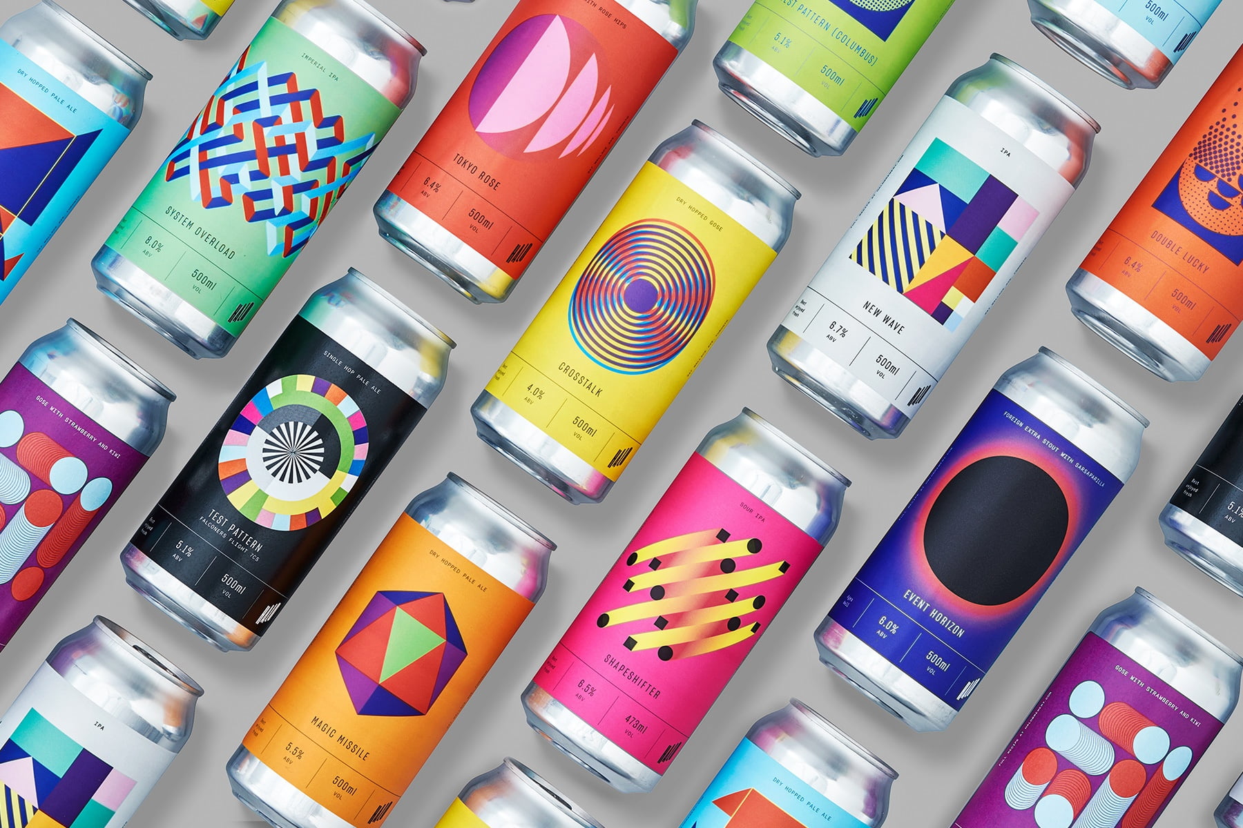
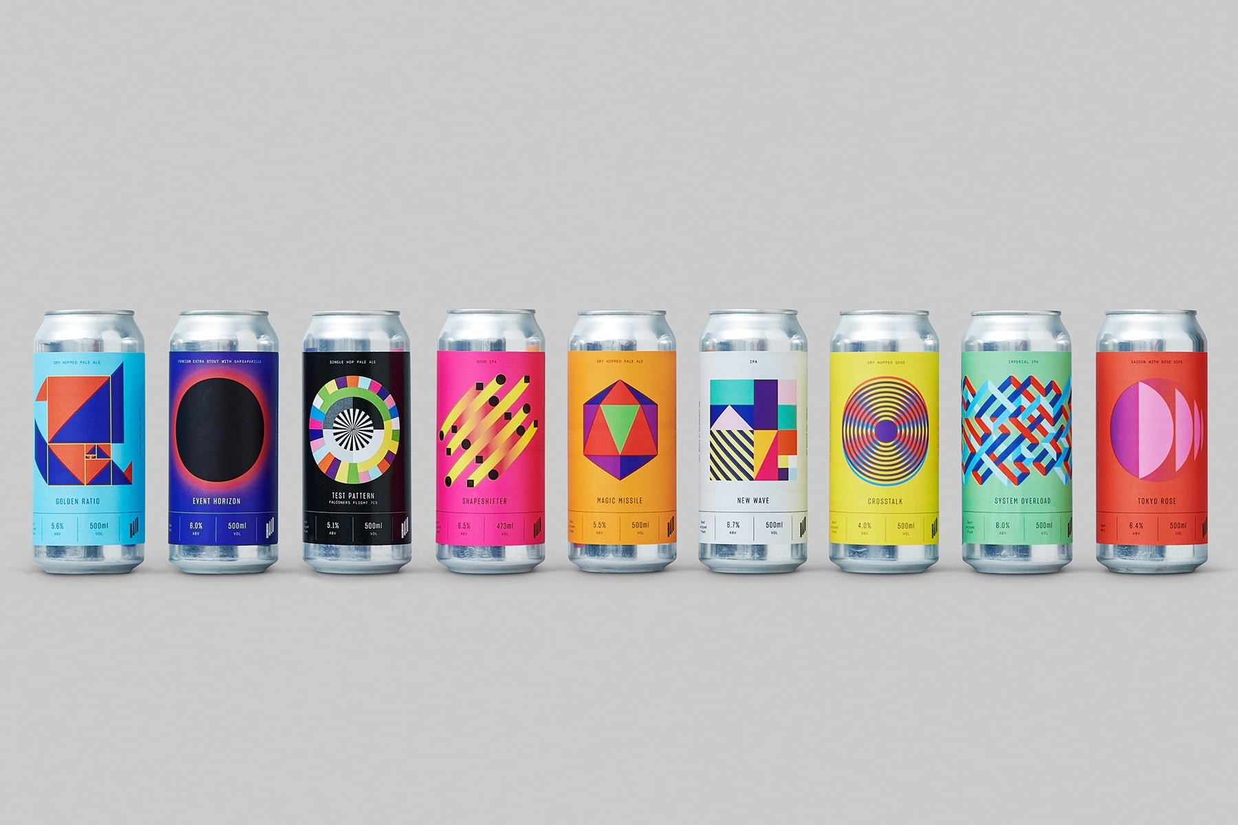
Halo is an adventurous brewery that takes the traditional recipes of rare styles of beer and experiments with the ingredients. With a taproom and bottle shop that welcome inquisitive visitors, the brewery needed an approachable brand that matched its unconventional sensibilities.
So they created a logo, labels, and packaging that use geometric patterns in unexpected colors, resulting in a look that’s energetic, modern and a bit rebellious, explains Claire Dawson, creative director at Underline Studio, the studio behind the project. “This direction was very intentionally chosen as a way for Halo to stand apart visually in the craft beer space.”
2. The tempon packaging
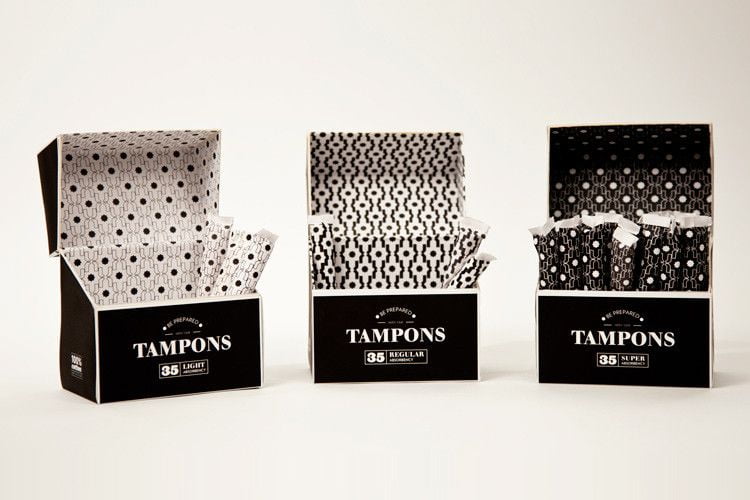
The patterns–inspired by Moroccan bath tiles and repeated on the individual tampon wrapping–aren’t just decorative: They also represent different tampon absorbencies; the darker the pattern, the more absorbent the tampon or in other words, the density of the pattern represents light or heavy flow. It’s a clever use of a simple graphical device.
The key of hierarchy is separation, you have to make marks of difference. The contrast should be strong enough for people to make a difference so they can pick up the right product. The most important thing isn’t necessarily at the top of the page. Maybe it’s the only thing that a box has, therefore, the designers can really express hierarchy in surprising ways, not just obvious ways.
5. Grids
Grids are a powerful tool in the page layout. They give structure to the page and increase the efficiency of the design process. The basic is vertical columns and horizontal rows. In graph paper, the divisions are perfectly laid out. Designers use grids to generate patterns and different shapes. The fields of the grid can provide a basic structure to page layout. A typographic grid has more than just columns and rows, it also has margins and gutters. A margin is a space around the edge of the layout and gutters are the space between blocks of contents.
So, why are grid so important in layout design?
The grids help in designing your place, size elements, and grid contains consistency over many pages. Here, the designer left some places blank creating dynamic layouts. The grid is invisible yet presents the red space as structured. It doesn’t feel empty, it feels supported by the grid. Working with 8 or more columns gives you more freedom than working with just two or three.
Suppose, you’re going to create content that usually spans multiple columns. So, a picture might be 3 columns wide, a block of text might be two columns wide or sometime the captions might be just one column wide.
This poster by Paul Sahre uses the space in abstract lines bringing life to the typography design. The grid expands not only in a vertical and horizontal way but also in a 30-degree angle. These horizontal, vertical and angular grids are providing space, dynamism between and around the element.
I am putting up a list of graphic design books you should definitely go through for further strengthening your knowledge of the subject.
- Thinking With Type – Ellen Lupton
- A Type Primer – John Kane
- The Elements of Typographic Style – Robert Bringhurst
- Just My Type – Simon Garfield
- Typeface Documentary
- New Illustration with Type – Martin Dawber
- 100 Habits of Successful Freelance Designers – Steve Gordon Jr.
- Never Sleep – dress code
- Graphic Design A Concise History – Richard Hollis
- The Cheese Monkeys – Chip Kidd
Happy readings!